
5 Python Libraries for Automating Executive Reports with AI

The periodic generation of executive reports is a critical task in the professional environment that consumes considerable time when performed manually. However, any systematic process that relies on logical rules is an ideal candidate for end-to-end automation.
Python makes it possible to unify highly complex workflows into a single process: from data ingestion and transformation, to the generation of analytical charts, AI-driven narrative conclusions, and final layout in a document ready for distribution.
In this article, we examine the five libraries we consider essential for building this ecosystem.
1. Pandas: the data processing engine
In document automation, pandas acts as the engine for data ingestion, cleaning, and transformation. Although Python allows information to be managed with native structures such as lists or dictionaries, these become inefficient and difficult to maintain at scale.
pandas introduces the DataFrame: a two-dimensional indexed structure that enables vectorized operations (without for loops), automatically aligned indexing, and complex joins in a single line of code.
Connecting to databases with read_sql_query
The data that will feed the report typically lives in SQL databases. With read_sql_query we can load the result of a query directly into a DataFrame, preserving the name, format and data type of each column.
import pandas as pd

query_report = """
    SELECT
        product_id,
        category,
        SUM(quantity)   AS total_sold,
        SUM(line_total) AS revenue
    FROM sales
    WHERE sale_date >= ?
    GROUP BY product_id, category;
"""

df_sales = pd.read_sql_query(
    query_report,
    database_connection,
    params=['01-01-2026']
)
Accessing data within a DataFrame
# Sort from highest to lowest revenue
df_sales.sort_values(by='revenue', ascending=False, inplace=True)

# Extract the top product ID (row 0, column 0)
top_product = df_sales.iloc[0, 0]

# Extract the revenue of the lowest-performing product (last row, column 3)
worst_revenue = df_sales.iloc[-1, 3]

# Subset: first 3 rows, columns 'product_id' and 'category'
top_3_products = df_sales.iloc[0:3, 0:2]

# Revenue value for a specific product ID
product_revenue = df_sales.loc[
    df_sales['product_id'] == 'PROD-1024', 'revenue'
].values[0]
Mathematical and statistical operations
# Global aggregations
total_global_revenue = df_sales['revenue'].sum()
average_units        = df_sales['total_sold'].mean()

# Percentiles and distribution
median_revenue   = df_sales['revenue'].quantile(0.5)
top_25_threshold = df_sales['revenue'].quantile(0.75)

# Vectorized arithmetic between columns
df_sales['avg_unit_price'] = (
    df_sales['revenue'] / df_sales['total_sold']
).round(2)

# Automated statistical summary (mean, std, min, max)
statistical_summary = df_sales[['total_sold', 'revenue']].describe()
2. python-docx: the document layout engine
If pandas is the analytical brain, python-docx is the component that translates those results into native Microsoft Word (.docx) format. Its real potential lies not in building blank pages from scratch, but in manipulating predefined templates: the base document is designed in Word with corporate styles and logos, and the code is used exclusively to find placeholders and dynamically inject text, charts and data tables.
Managing paragraphs, styles and runs
In python-docx, a paragraph is divided into runs (text sequences sharing the same formatting). To change the style of a single word within a sentence — for example, to highlight a KPI — text is added through these specific blocks.
from docx import Document
from docx.shared import Inches, Pt
from docx.enum.text import WD_ALIGN_PARAGRAPH

# Initialize the document (or load a template: Document('template.docx'))
doc = Document()

# Centered main heading
title = doc.add_heading('Commercial Performance Executive Report', level=1)
title.alignment = WD_ALIGN_PARAGRAPH.CENTER

# Paragraph with a bold fragment using a run
intro_paragraph = doc.add_paragraph(
    'The following section presents the analytical results of the campaign. '
)
highlighted_run = intro_paragraph.add_run(
    'It is critical to note that all global targets have been met.'
)
highlighted_run.bold      = True
highlighted_run.font.size = Pt(11)
Dynamic image insertion
The workflow consists of saving the chart as a .png file and then embedding it by defining the width so the aspect ratio scales automatically.
doc.add_heading('Revenue Distribution by Category', level=2)
doc.add_picture('revenue_chart.png', width=Inches(6.0))

caption = doc.add_paragraph(
    'Figure 1.1: Vectorized revenue distribution by product family.'
)
caption.alignment = WD_ALIGN_PARAGRAPH.CENTER
Automatic DataFrame-to-Word table export
# 1. Dimensions: rows = data + header, columns = DataFrame fields
num_rows    = df_sales.shape[0] + 1
num_columns = df_sales.shape[1]

# 2. Create table structure with a native Word style
table       = doc.add_table(rows=num_rows, cols=num_columns)
table.style = 'Light Shading Accent 1'

# 3. Populate the header row
hdr_cells = table.rows[0].cells
for i, col_name in enumerate(df_sales.columns):
    hdr_cells[i].text = str(col_name).replace('_', ' ').title()

# 4. Populate data rows
for row_idx in range(df_sales.shape[0]):
    row_cells = table.rows[row_idx + 1].cells
    for col_idx in range(num_columns):
        row_cells[col_idx].text = str(df_sales.iat[row_idx, col_idx])

# 5. Save the final document
doc.save('Final_Sales_Report.docx')
3. Matplotlib: the visual translation of data
A report made up exclusively of text and dense tables overwhelms the executive reader. matplotlib turns the abstract metrics from pandas into high-impact charts that allow trends, anomalies and performance figures to be identified in seconds.
In an automation ecosystem, matplotlib runs silently: it models the chart, applies corporate color palettes and exports the result as a high-resolution static image. python-docx then embeds it into the document.
Bar chart: revenue comparison by category
import matplotlib
matplotlib.use('Agg')  # Headless backend for automated environments
import matplotlib.pyplot as plt

# 1. Group data by category
df_chart = df_sales.groupby('category')['revenue'].sum().reset_index()
df_chart.sort_values(by='revenue', ascending=True, inplace=True)

# 2. Initialize figure
fig, ax = plt.subplots(figsize=(7, 4))

# 3. Horizontal bars
bars = ax.barh(
    df_chart['category'],
    df_chart['revenue'],
    color='#1f77b4',
    edgecolor='none'
)

# 4. Corporate styling
ax.set_title(
    'Global Revenue Distribution by Category',
    fontsize=12, pad=15, fontweight='bold', color='#333333'
)
ax.set_xlabel('Accumulated Revenue (€)', fontsize=10, labelpad=10, color='#555555')
ax.spines['top'].set_visible(False)
ax.spines['right'].set_visible(False)
ax.spines['left'].set_color('#cccccc')
ax.spines['bottom'].set_color('#cccccc')
ax.grid(axis='x', linestyle='--', alpha=0.5)

# 5. Export to disk
plt.tight_layout()
plt.savefig('revenue_chart.png', dpi=300, bbox_inches='tight')
plt.close(fig)
Scatter plot: multi-variable correlation
When the report requires crossing two metrics to evaluate their correlation — for example, whether higher sales volume translates proportionally into higher revenue — a scatter plot provides the ideal technical perspective.
fig, ax = plt.subplots(figsize=(7, 4))

ax.scatter(
    df_sales['total_sold'],
    df_sales['revenue'],
    color='#2ca02c',
    alpha=0.7,
    edgecolors='w',
    s=80
)

# Automatic annotation of the top revenue outlier
max_row = df_sales.loc[df_sales['revenue'] == df_sales['revenue'].max()]
if not max_row.empty:
    ax.annotate(
        f"Leader: {max_row['product_id'].values[0]}",
        xy=(max_row['total_sold'].values[0], max_row['revenue'].values[0]),
        xytext=(10, -10),
        textcoords='offset points',
        fontsize=9,
        fontweight='bold',
        arrowprops=dict(arrowstyle="->", color='#333333', lw=0.8)
    )

ax.set_title(
    'Correlation: Sales Volume vs Revenue by Product',
    fontsize=12, pad=15, fontweight='bold'
)
ax.set_xlabel('Total Units Sold', fontsize=10)
ax.set_ylabel('Total Revenue (€)', fontsize=10)
ax.spines['top'].set_visible(False)
ax.spines['right'].set_visible(False)
ax.grid(True, linestyle=':', alpha=0.6)

plt.tight_layout()
plt.savefig('correlation_chart.png', dpi=300, bbox_inches='tight')
plt.close(fig)
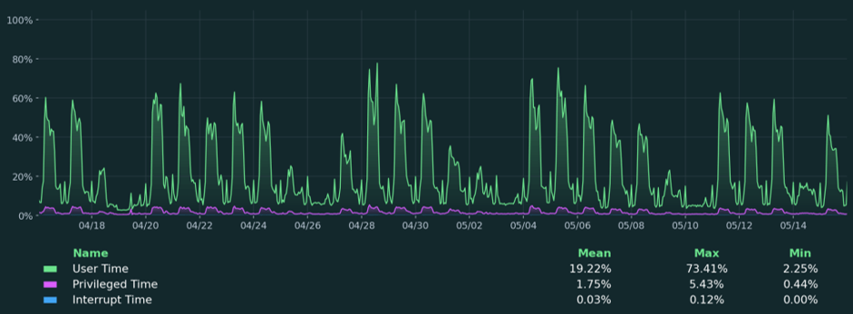
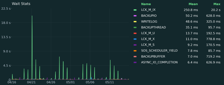
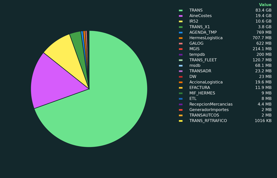
As database experts, we use
matplotlibto generate the analytical charts that appear in Coyote Monitor, our SQL instance monitoring tool. Below are some examples of what can be achieved with this library:
4. Azure OpenAI: the intelligent conclusions writer
A report remains incomplete without the key piece: qualitative analysis. In a traditional workflow, an analyst must review the results to write executive summaries, detect deviations and propose next steps.
Azure OpenAI transforms this process entirely. Its role here is not that of a conversational chatbot, but that of a corporate synthesis engine: by feeding the model with the key KPIs calculated by pandas through structured prompts, the AI drafts “Executive Summary”, “Deviation Analysis” or “Conclusions” sections with a formal, coherent tone in seconds. Integrating it via Azure ensures compliance with enterprise data privacy and governance regulations.
Client initialization and context building
import os
from openai import AzureOpenAI

# 1. Initialize the client using environment variables
client = AzureOpenAI(
    azure_endpoint = os.getenv("AZURE_OPENAI_ENDPOINT"),
    api_key        = os.getenv("AZURE_OPENAI_KEY"),
    api_version    = "2024-02-15-preview"
)

# 2. Extract key metrics from the DataFrame to build the prompt context
top_product_id      = df_sales.iloc[0, 0]
top_product_revenue = df_sales.iloc[0, 3]
total_campaign_revenue = df_sales['revenue'].sum()

metrics_context = f"""
- Total Campaign Revenue: {total_campaign_revenue:,.2f} €
- Top-Selling Product (ID): {top_product_id}
- Revenue Generated by Leader: {top_product_revenue:,.2f} €
"""
Structured model request
ai_response = client.chat.completions.create(
    model="your-azure-deployment-name",  # Deployment Name in Azure AI Studio
    messages=[
        {
            "role": "system",
            "content": (
                "You are a senior financial analyst. Your task is to write the formal executive "
                "summary for the monthly board of directors report. Be concise, use a strictly "
                "professional tone and analyze only the data provided without inventing "
                "external metrics."
            )
        },
        {
            "role": "user",
            "content": (
                f"Write an analytical paragraph based strictly on the following "
                f"quarterly KPIs:\n{metrics_context}"
            )
        }
    ],
    temperature=0.3
)

# Extract the generated text
conclusions_text = ai_response.choices[0].message.content
5. python-dotenv: the credentials guardian
When the pipeline connects to corporate databases and the Azure OpenAI API, security becomes the top priority. One of the most common vulnerabilities in software development is hardcoding: writing usernames, passwords and access tokens directly into the source code. If that script is accidentally pushed to a public repository, the entire organization’s security is immediately compromised.
python-dotenv implements one of the golden rules of modern cybersecurity: separate configuration from code. It stores all credentials in a local .env file, isolated from the source code. When the script runs, load_dotenv() loads those values into memory without them ever appearing in any accessible file.
Project structure
my_automation_project/
├── .gitignore          ← Excludes .env from Git
├── .env                ← Local credentials (never committed to the repository)
└── report_script.py    ← Clean source code with no hardcoded secrets
The .env file
DB_ENGINE="postgresql"
DB_USER="reports_admin"
DB_PASSWORD="StrongAndSecurePassword2026"
DB_HOST="localhost"
DB_PORT="5432"
DB_NAME="sales_production"

AZURE_OPENAI_ENDPOINT="https://my-azure-resource.openai.azure.com/"
AZURE_OPENAI_KEY="9876543210abcdef9876543210abcdef"
The .gitignore file
# Exclude local configuration and credentials
.env
Secure loading in the script
import os
from dotenv import load_dotenv
from sqlalchemy import create_engine
from openai import AzureOpenAI

# 1. Load .env variables into memory
load_dotenv()

# 2. Build the database connection string securely
db_url = (
    f"{os.getenv('DB_ENGINE')}://"
    f"{os.getenv('DB_USER')}:{os.getenv('DB_PASSWORD')}@"
    f"{os.getenv('DB_HOST')}:{os.getenv('DB_PORT')}/{os.getenv('DB_NAME')}"
)
engine = create_engine(db_url)

# 3. Initialize the Azure OpenAI client without exposing the API key
client = AzureOpenAI(
    azure_endpoint = os.getenv("AZURE_OPENAI_ENDPOINT"),
    api_key        = os.getenv("AZURE_OPENAI_KEY"),
    api_version    = "2024-02-15-preview"
)
Conclusion
Automating document generation with Python represents a paradigm shift in operational efficiency. By integrating these five libraries, each component plays a strategic and complementary role:
| Library | Role in the ecosystem |
|---|---|
pandas | Data ingestion, cleaning and transformation |
matplotlib | Analytical chart generation |
python-docx | Professional Word document layout |
Azure OpenAI | Automated qualitative analysis writing |
python-dotenv | Credential security and integrity |
The result is a reproducible workflow that eliminates repetitive manual work and delivers consistent, accurate reports ready for decision-making.
Want to automate your organization’s reports with Python and Azure?
This library ecosystem is powerful on its own, but reaches its full potential when combined with a solid data architecture: well-structured data sources, semantic models in Microsoft Fabric and AI capabilities integrated through Azure OpenAI.
At Aleson ITC we help organizations build Data Analytics and Microsoft Fabric workflows that automate everything from data ingestion to executive report generation, connecting the entire pipeline under the Microsoft ecosystem.
If your team spends hours every week consolidating data and manually laying out reports, we can help you design an automated workflow tailored to your needs.
FAQ — Frequently asked questions about Python document automation
What Python libraries are used to generate Word documents automatically?
The most common combination is pandas for data processing, matplotlib for chart generation and python-docx for assembling the final .docx document. This architecture takes raw data all the way to a professional report without any manual intervention.
Is it safe to use database and API credentials in Python scripts?
Only if managed correctly. The recommended practice is to use python-dotenv to store credentials in a local .env file, excluded from the repository via .gitignore. They should never be written directly into the source code.
What is the advantage of using .docx templates over generating documents from scratch?
Templates allow the design or communications team to define corporate styles, headers and logos once in Word. The code only needs to find placeholders and inject dynamic content, ensuring visual consistency without developers having to manage the design layer.
Can this workflow be connected to Microsoft Fabric or Power BI?
Yes. pandas can connect to any compatible data source, including Microsoft Fabric endpoints via SQL or REST APIs. The generated reports can also complement Power BI dashboards as executive distribution documents.
If you need an integrated architecture, the Aleson ITC Data Analytics team can help you design it.